Modern Resume Templates That Pass ATS (2026)
Find modern resume templates that look professional and pass ATS screening. Learn which design elements are safe, which break parsing, and how to choose by industry.
Raman M.
Software Engineer & Career Coach

On this page
Build a resume that gets interviews
- ATS-optimized templates
- AI-powered writing
- Free to start
No credit card required
Your 2020 resume template looks dated. The fonts feel heavy, the layout feels cluttered, and you know it's not making the impression it used to.
So you go looking for something modern. You find sleek templates with sidebars, infographic elements, skill bars, and creative layouts. They look incredible on screen.
Here's the problem: half of those modern templates get rejected by ATS before a human ever sees them. The very design elements that make them look contemporary are the same elements that break automated parsing. And with over 75% of mid-to-large companies using ATS software, a template that can't be parsed is a template that gets you ignored.
The good news is that "modern" and "ATS-friendly" aren't opposites. You don't have to choose between a resume that looks professional and one that actually reaches a recruiter. You just need to know which design elements are safe and which ones will sabotage your applications.
What Makes a Resume Template "Modern" in 2026
Modern resume design isn't about flashy graphics or unusual layouts. It's about clean, confident presentation. The best contemporary templates share a few characteristics that separate them from the cluttered, over-designed resumes of five years ago.
Clean typography. Modern templates use system fonts, Inter, Calibri, or similar sans-serif typefaces. They're readable on screens of every size. Decorative fonts, script fonts, and anything that looks like a wedding invitation are firmly in the past.
Strategic use of color. One accent color, used sparingly. A colored section header, a subtle line divider, a small accent on your name. Not a rainbow. Not a full-color sidebar. Just enough to signal personality without screaming for attention.
Generous white space. This is the single biggest shift in resume design. Modern templates let content breathe. Cramming every pixel with text looks desperate and hard to read. White space communicates confidence and makes your key achievements easier to spot during that 7.4-second recruiter scan.
Clear visual hierarchy. Your name is the largest element. Section headers stand out from body text. Job titles are distinct from company names and dates. The reader's eye flows naturally from top to bottom without getting lost. This hierarchy comes from font size, weight, and spacing, not from graphics or boxes.
Subtle design touches. Think thin divider lines between sections, a small color accent on your section headers, or a slightly larger first letter in your summary. These are the details that make a template feel polished without interfering with ATS parsing.
A modern resume template is one that looks like it was designed this year, reads easily on both screen and paper, and gets parsed correctly by every ATS on the market. That's the standard.
5 Modern Template Styles That Actually Work
Not every "modern" template is created equal. These five style archetypes are the ones that consistently pass ATS screening while still looking current and professional. Each one works for different situations, so choosing the right style depends on your industry, experience level, and the impression you want to make.
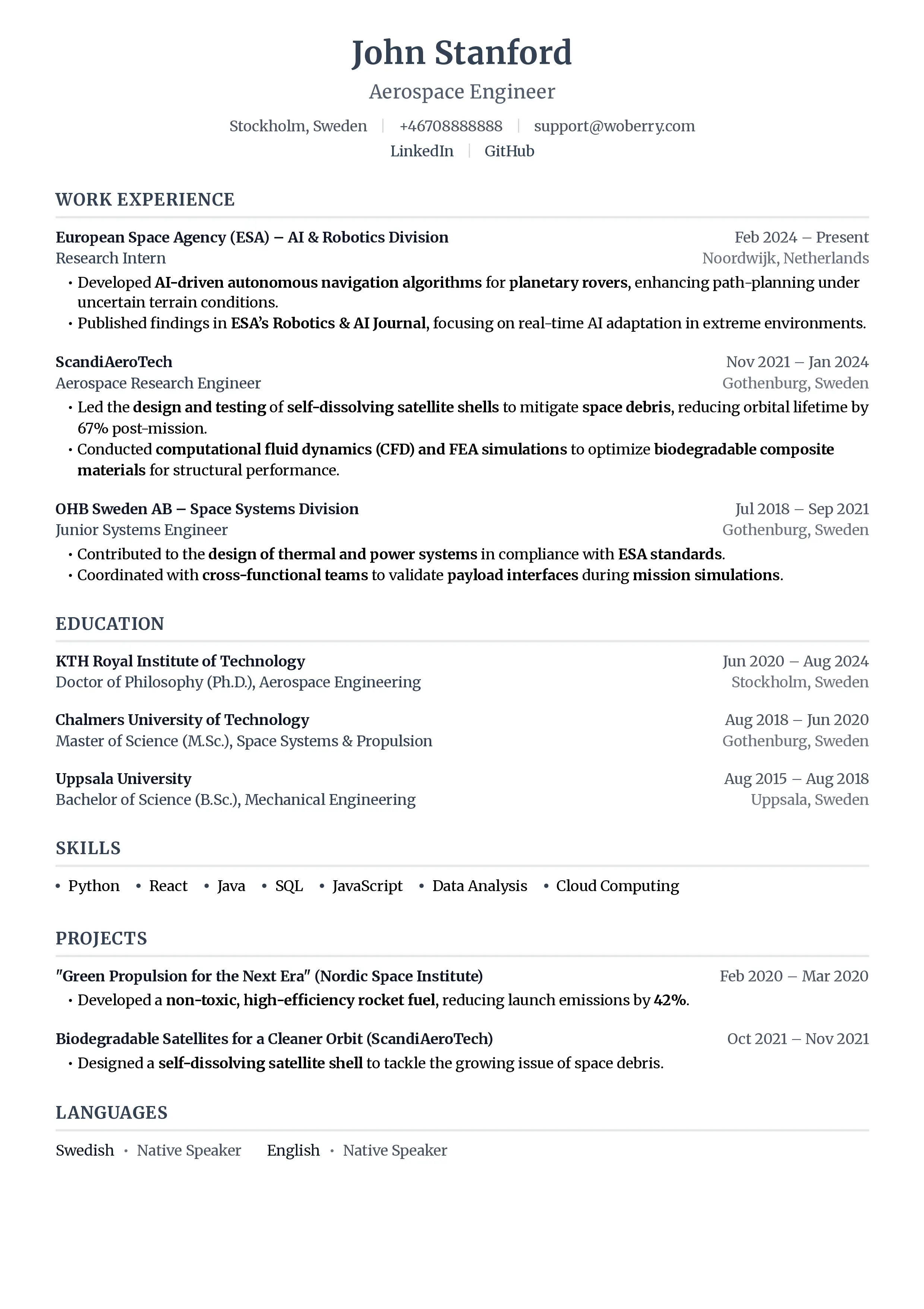
1. Clean Minimal
Single column, generous white space, sans-serif font, no decorative elements. Every element earns its place. This is the template equivalent of a well-tailored white shirt: timeless and universally appropriate.
What it looks like: Your name at the top in a slightly larger font. Contact info on one line below it. Clear section headers (Experience, Education, Skills) with consistent spacing. No color, no lines, no accents. Just clean text and smart spacing.
Best for: Tech, consulting, finance, and any company where substance matters more than style. If you're applying to Goldman Sachs or McKinsey, this is your template. If you're applying to a Series B startup, this works too.
When to use it: When you're not sure what style to pick. Clean Minimal is the safest choice in any situation. It never looks wrong.
Browse ResumeFast's Clean Minimal templates to see this style in action. Every template is ATS-tested.
2. Accent Bar
A single column layout with one distinctive design element: a thin colored bar along the left side or top of the page. That's it. One accent, one color, one moment of visual interest.
What it looks like: Everything in Clean Minimal, plus a 3-5px colored bar running along the left edge or across the top. Section headers might use the same accent color. The color is muted, not neon. Think slate blue, forest green, or burgundy.
Best for: Marketing, design-adjacent roles, startups, and anyone who wants to show a hint of personality without risk. It says "I have taste" without saying "I prioritize aesthetics over substance."
When to use it: When you want to stand out slightly from the sea of black-and-white resumes but you're still applying through an ATS. The bar is a visual element, but since it's not text, ATS software simply ignores it. Your content still parses perfectly.
Explore Accent Bar styles on ResumeFast, where every color option has been tested against major ATS platforms.
3. Bold Header
A large, confident name and title section at the top, sometimes with a subtle background color on just that header area. The body below is standard format. It's the resume equivalent of a firm handshake.
What it looks like: Your name in a noticeably larger font (24-32pt instead of the typical 16-20pt). Your target title or professional tagline directly below. Maybe a light gray or soft color background behind just the header block. The rest of the resume is standard single-column format.
Best for: Senior professionals, executives, directors, and anyone with enough experience that their name and title should command the page. If you have 15+ years of experience, your resume should feel authoritative.
When to use it: When you're applying to leadership roles where presence matters. A Bold Header resume communicates seniority before the reader even gets to your experience section. Just make sure the background color is light enough that text stays readable when printed in black and white.
Find your Bold Header template on ResumeFast and customize it with your own accent colors.
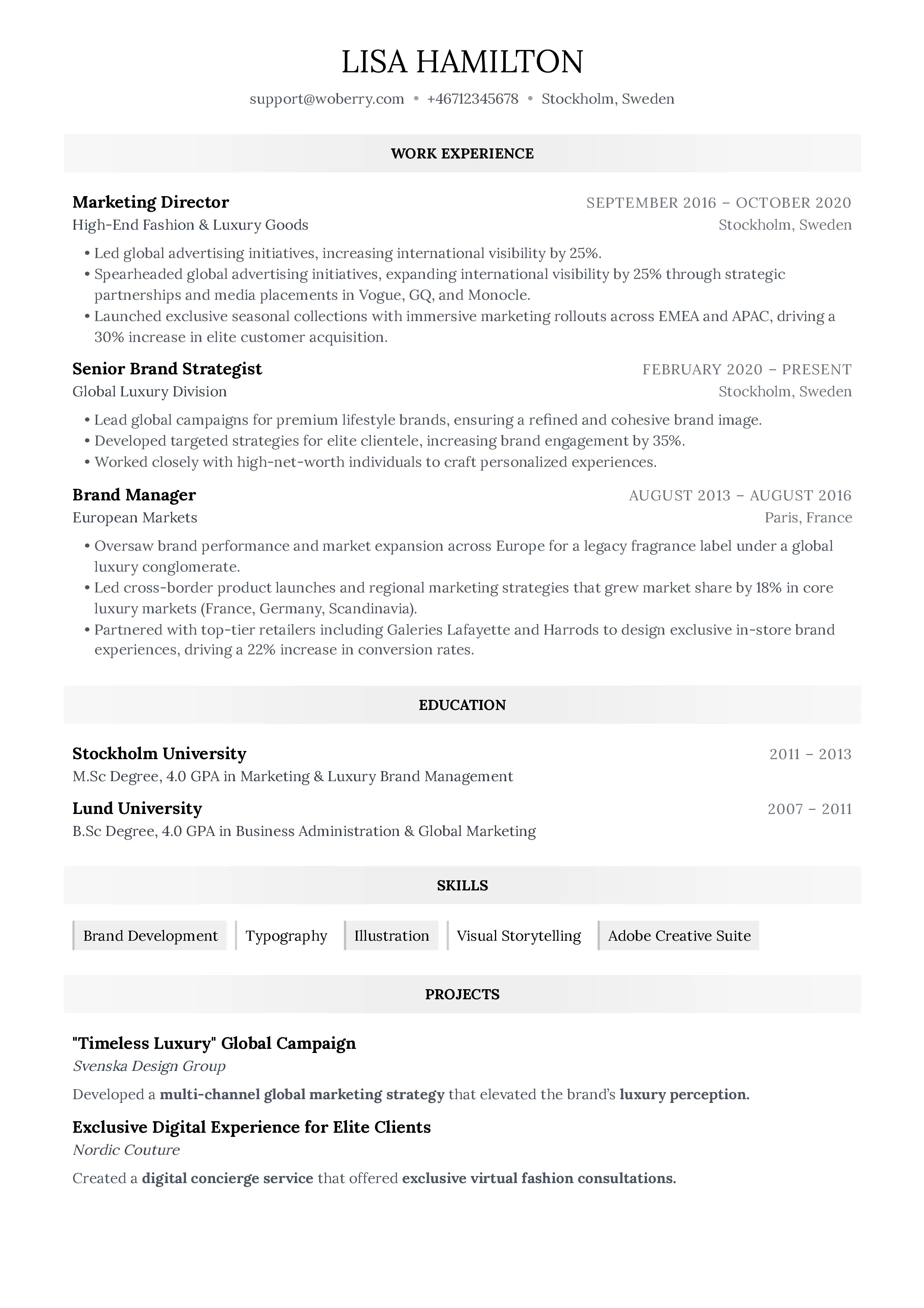
4. Two-Tone
A subtle color block in the header area that transitions to a white body. Think of it as the Accent Bar's slightly bolder sibling. The color area might contain your name, contact info, and a brief summary or objective, while the white area below holds your experience, education, and skills.
What it looks like: The top 15-20% of the page has a muted background color (light navy, soft charcoal, or a pale accent). Your name and contact info sit within that block. The rest of the page is white with standard formatting.
Best for: Creative industries that still use ATS. Advertising agencies, media companies, design studios, and brand-focused organizations. These companies expect some visual polish but still run applications through parsing software.
When to use it: When the job posting or company culture signals that creativity is valued, but you know the application goes through an ATS first. Two-Tone gives you visual distinction without the parsing risks of sidebars or columns. If you're unsure whether a company values design, check their careers page for visual cues.
ResumeFast offers Two-Tone templates with carefully chosen color palettes that print well and parse cleanly.
5. Skills-Forward
Technical skills section prominently placed near the top of the resume, right after your summary. Instead of burying skills at the bottom, this style puts your capabilities front and center.
What it looks like: Summary at top, then a clearly formatted skills section organized by category (Programming Languages, Frameworks, Tools, Certifications). This section might use a clean grid layout or simple comma-separated lists under category headers. Work experience follows below.
Best for: Engineering, IT, data science, and any technical role where specific tools and technologies matter. When a recruiter is scanning for "Python, AWS, Kubernetes," they want to find those keywords immediately, not hunt through your job descriptions.
When to use it: When the job posting lists specific technical requirements. A Skills-Forward layout helps both ATS software and human recruiters quickly verify that you have the required capabilities. For a deeper dive on this approach, read our guide on the skills-based resume format.
Build your Skills-Forward resume on ResumeFast with organized skill categories that ATS software reads correctly.
Resume Templates That Get Interviews
15+ professional templates, all ATS-optimized
Browse All TemplatesModern + ATS-Friendly
Every ResumeFast template is designed to look great AND pass ATS filters. No trade-offs.
Modern Templates That Fail ATS (What to Avoid)
Knowing what works is only half the equation. You also need to recognize the template styles that look modern but will quietly destroy your job applications. These designs are everywhere on template marketplaces, and they all share one problem: ATS software can't read them.
Infographic resumes. Timelines, icons, charts, and graphics arranged like a marketing one-pager. They look stunning on Dribbble. They're completely unreadable by ATS. The software sees a jumble of image layers and coordinates, not your work history.
Multi-column layouts. Two or three columns of text side by side. The problem is that ATS reads content top-to-bottom, left-to-right, line by line. A two-column layout means the software reads half of your job title on the left, then half of your skills section on the right, then mashes them together into nonsense. Your "Senior Product Manager" becomes "Senior Pro Python, AWS" because the columns merged on the same line.
Templates with icons replacing text. A phone icon instead of the word "Phone." An envelope instead of "Email." A location pin instead of your city. These look clean to humans. ATS sees nothing. Your contact information vanishes entirely.
Skill bar charts and progress circles. Those visual representations of your skill levels (Python: 90%, Excel: 75%) are meaningless to both ATS and human recruiters. ATS can't read them at all. And a recruiter has no idea what "75% Excel" means. 75% of what? Compared to whom?
Text embedded in images. Some templates, particularly from Canva and similar design tools, export text as image layers rather than actual text data. The resume looks perfect visually, but when ATS tries to extract text, it finds nothing. Your entire resume reads as a blank page.
Tables used for layout. HTML-style tables might arrange content neatly on screen, but they create reading-order chaos for parsers. ATS often reads table cells in unpredictable order, scattering your content like shuffled cards. Dates end up next to the wrong job titles. Skills merge with education entries.
The bottom line: if a design element carries information that isn't also present as plain text, ATS will miss it. Every piece of content on your resume should be selectable, copyable, and readable as plain text. That's the test.
How to Choose by Industry
Different industries have different expectations for what a "professional" resume looks like. Here's a quick guide to matching your template style with your target field.
Tech and Engineering: Clean Minimal or Skills-Forward. These industries care about what you can do, not how your resume looks. A clean layout with prominent technical skills signals that you prioritize substance. Fancy design can actually work against you, implying you're compensating for weak technical chops.
Finance and Consulting: Clean Minimal, full stop. These are conservative industries where tradition signals competence. Black text, white paper, no color, no design elements. Your credentials and results should speak entirely for themselves.
Marketing and Brand: Accent Bar or Two-Tone. You work in a visual field, and your resume is part of your personal brand. A tasteful accent color shows you understand design principles. Just don't go overboard, you're a marketer, not a graphic designer.
Healthcare: Clean Minimal. Healthcare is one of the most ATS-heavy industries. Hospitals and health systems run everything through parsing software, and hiring managers are accustomed to traditional formats. Keep it straightforward and focus on certifications, clinical experience, and measurable outcomes.
Creative fields (design, UX, video): Two-Tone for applications that go through ATS. But for creative roles, your resume is secondary to your portfolio. Use the resume to get past the ATS and into a human's hands, then let your portfolio do the convincing. A separate portfolio website or case study document is where you showcase visual creativity.
Startups: Accent Bar or Bold Header. Startups often have less formal cultures, and a small design touch signals that you'll fit. But don't assume startups skip ATS. Many use tools like Lever, Greenhouse, or Ashby, all of which parse resumes. Your template still needs to be parseable.
Customizing Your Template Without Breaking ATS
You've picked a template style. Now you want to make it yours. Here's what you can safely change and what you should never touch.
Safe Changes
- Font size: Anywhere between 10pt and 12pt for body text. Slightly larger (14-16pt) for your name. ATS doesn't care about font size.
- Accent color: Change it to match your personal brand or industry norms. ATS ignores color entirely.
- Section order: Move Education above or below Experience. Rearrange Skills placement. ATS reads every section regardless of order.
- Adding or removing sections: Include a Certifications section, remove an Objective, add a Projects section. ATS adapts to standard section headers.
- Line spacing and margins: Adjust for length. Tighter spacing (1.0-1.15) to fit more content, wider spacing (1.3-1.5) for a more open feel. Both parse identically.
Unsafe Changes
- Adding columns: Going from one column to two or three breaks parsing order. Even a narrow sidebar for contact info can scramble how ATS reads your content.
- Inserting images: Photos, logos, icons, or any image element. ATS either ignores them or chokes on them.
- Using text boxes: Text inside a text box may be read out of order or skipped entirely by ATS parsers.
- Custom headers and footers: Content in the header/footer area of a document is often invisible to ATS. Don't put your contact info there.
- Switching to landscape orientation: ATS expects portrait layout. Landscape resumes parse unpredictably.
Every safe change is about styling text. Every unsafe change involves altering the document structure. As long as your resume is a single stream of text flowing top to bottom, you're fine.
Free vs Pro Templates: An Honest Comparison
Not everyone needs a premium resume template. Here's what each tier typically offers so you can decide what makes sense for your situation.
What Free Templates Give You
Free templates, whether from ResumeFast's free tier or other resume builders, typically include:
- 2-3 basic layout options (usually Clean Minimal style)
- Standard formatting with limited color options
- Basic section structure (Summary, Experience, Education, Skills)
- PDF export that passes ATS
For many job seekers, especially those in conservative industries or early in their careers, a free template is genuinely all you need. A Clean Minimal template with strong content will outperform a fancy Pro template with weak content every single time.
What ResumeFast Includes for Free
ResumeFast gives you everything at no cost:
- More style options across all five archetypes (Accent Bar, Bold Header, Two-Tone, Skills-Forward)
- Full color customization with industry-appropriate palette suggestions
- AI-powered content suggestions that help strengthen your bullet points
- ATS compatibility scoring that tests your final document against major parsing engines
- Multiple export formats and the ability to tailor versions for different applications
When a Simple Template Is Enough
If you're applying to one specific role and your experience is straightforward, a basic template does the job. If you're in finance, healthcare, or academia where conservative formatting is expected, you don't need design variety.
When to Use Advanced Features
If you're applying across industries and need different styles for different contexts. If you want AI assistance writing stronger bullet points. If you want the confidence of knowing your specific resume file passes ATS before you submit it. Or if you simply want more control over the visual details.
Browse ResumeFast's full template collection to see all available options. Every template is ATS-tested and ready to customize, completely free.
Frequently Asked Questions
What is the best modern resume format for 2026?
The best modern resume format for 2026 is a single-column, clean layout with a sans-serif font, clear section headers, and strategic use of white space. This format passes ATS parsing reliably while looking current and professional. Add one accent color for personality, but keep the structure simple.
Are modern resume templates ATS-friendly?
Some are, some aren't. Modern templates that use clean typography, single-column layouts, and standard section headers pass ATS without issues. Templates that rely on multi-column layouts, infographic elements, skill bar charts, or text embedded in images will fail ATS parsing. Always test by copying your resume text and pasting it into a plain text editor. If it reads correctly, ATS can read it too.
Should I use color on my resume?
Yes, but sparingly. One accent color used on section headers or a thin divider line adds a professional, contemporary touch. ATS software ignores color entirely, so it won't affect parsing. Avoid using color to convey information (like red for "urgent" skills), and make sure everything is readable when printed in black and white.
What font is best for a modern resume?
The safest and most modern fonts for resumes in 2026 are Inter, Calibri, Helvetica Neue, and system-ui sans-serif fonts. These render clearly on screens and in print, and they're universally supported. Avoid decorative fonts, script fonts, or anything that requires a custom font file, as these may not render correctly on the recruiter's system.
Can I use a two-column resume template?
It's risky. Two-column layouts cause parsing issues with most ATS software because the systems read text line by line from left to right, merging content from both columns into a single garbled stream. If you want to separate content visually, use clear section headers and spacing instead of columns. For a deeper explanation, see our guide on how ATS systems work.
Where can I find free modern resume templates?
ResumeFast offers free modern resume templates that are ATS-tested and ready to use. You can start building your resume immediately with no account required for the free tier. Other options include alternatives to Canva and other resume builder platforms, though ATS compatibility varies. Always verify that any free template passes ATS by testing it with a plain-text copy-paste check.
Your resume is your first impression. Make it count.
Join 10,000+ job seekers using ResumeFast to build ATS-optimized resumes that actually get interviews.
No credit card required. Free forever.
Continue Reading
View all articles
The Complete ATS Resume Guide (2026)

Do Headers and Footers Break ATS Parsing?

Resume Keyword Density: How Often to Repeat Keywords

ATS-Friendly Fonts: Which Fonts Pass Resume Scanners

How to Find Resume Keywords in a Job Description

Why Columns and Tables Break Your Resume in ATS
Build a resume that gets interviews
Ready to build your resume?